This story about restoring a classic car looked nice using just the images of the car itself. But, I needed a background to add visual interest. I decided to use images from the old parts manual for the car and ended up very happy with the look.

For this event promotion, I needed to convey the topic of “Digital Dentistry” but needed something more exciting to the viewer than the machinery or images of the actual practice of digital dentistry. An aesthetically pleasing smile with glowing gridlines and digital-looking cubes gets the point across well and the solid black field below makes the relevant information pop.

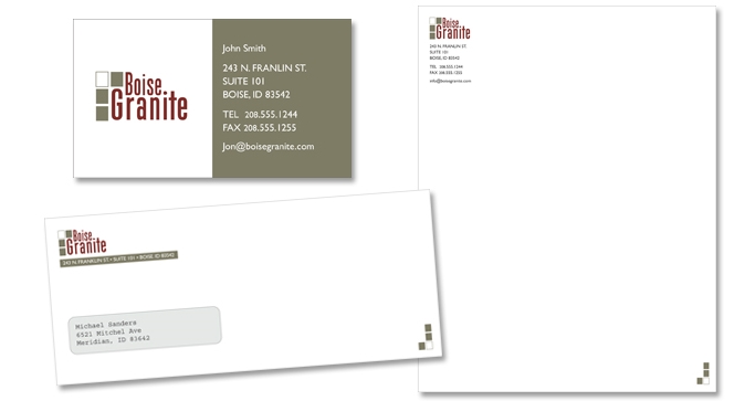
After years operating under a different name, Mr. Roger Ercolini asked for help re-inventing his print business for a new generation. After interviewing him about his target audience, market and goals, we agreed that he needed a name that would reflect his neighborhood and a look that would convey knowledge of the modern print industry.
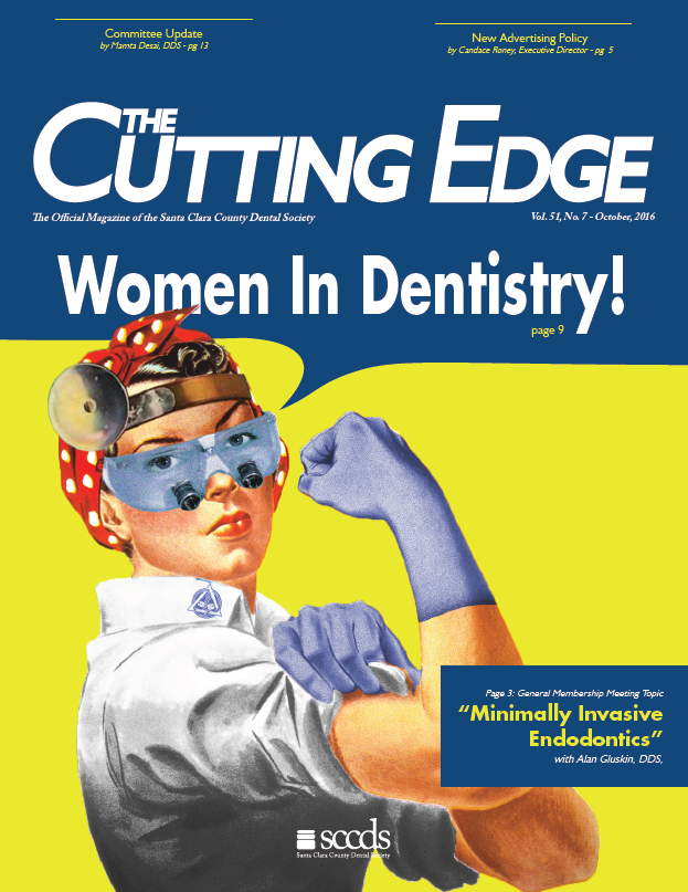
This was a fun cover. For the “Women in Dentistry” issue, I needed an iconic image that showed how far women have come in the dental industry. With a little bit of Photoshop work (adding protective eyewear, loupes, head-mounted mirror, gloves and a white smock) the classic Rosie the Riveter became Rosie the Dentist. This cover won an Honorable Mention for Best Cover from the International College of Dentists.

A long-time sponsor of the Dental Society submitted an ad for print in a recent issue. Unfortunately, there were many issues with the ad as I received it. I redesigned the ad to be more appealing, better organized and put a greater focus on the logo, slogan and contact information. The advertiser was thrilled with the result.
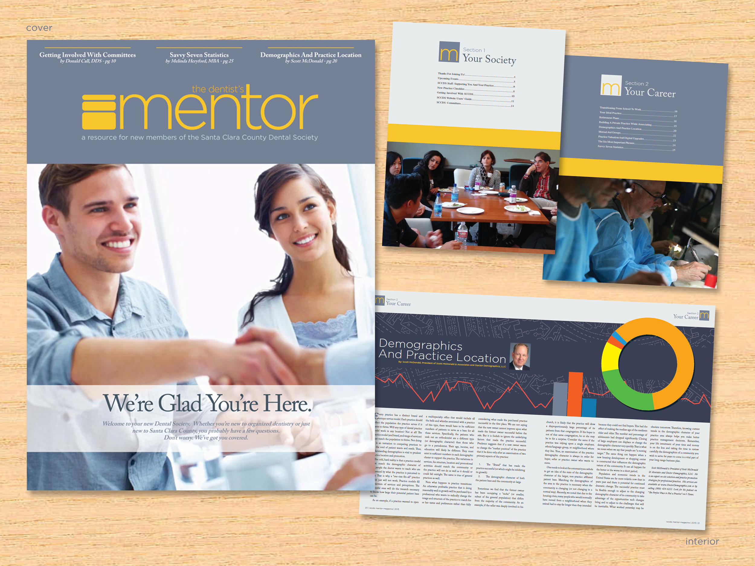
Request: Improve the experience of the Santa Clara County Dental Society's new members by delivering content tailored specifically to them.
Solution: I suggested creating a new web and print project with a clean, modern aesthetic aimed at younger viewers (age 25-35). I concentrated on good use of white space, minimizing ornamentation and a high-contrast color combination of yellow-orange over dark gray. I also chose photos that were taken by members whenever possible.
Skills: Adobe InDesign, Illustrator, committee management, custom illustration
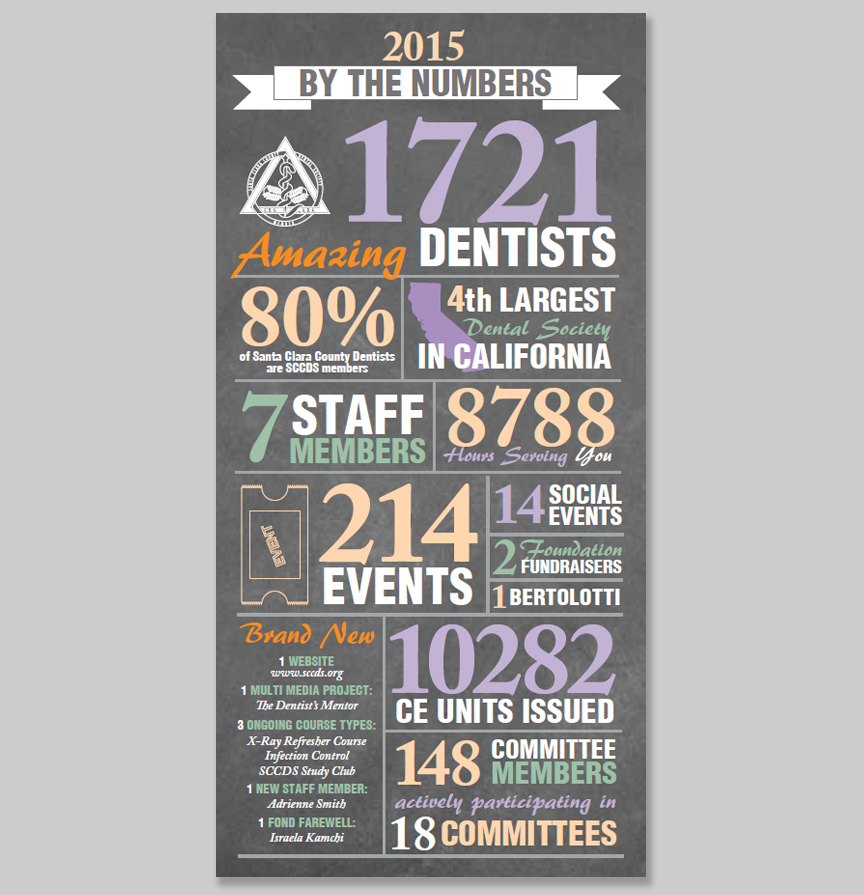
Like many organizations, SCCDS often repeats activities on a yearly basis. To alleviate the impression of repetition, I chose to highlight some of the numbers behind the scenes.
The reception has been positive. The infographic gives many members a new perspective on the amount of work that goes into keeping their organization running smoothly.
Adobe InDesign and Illustrator (CS5)
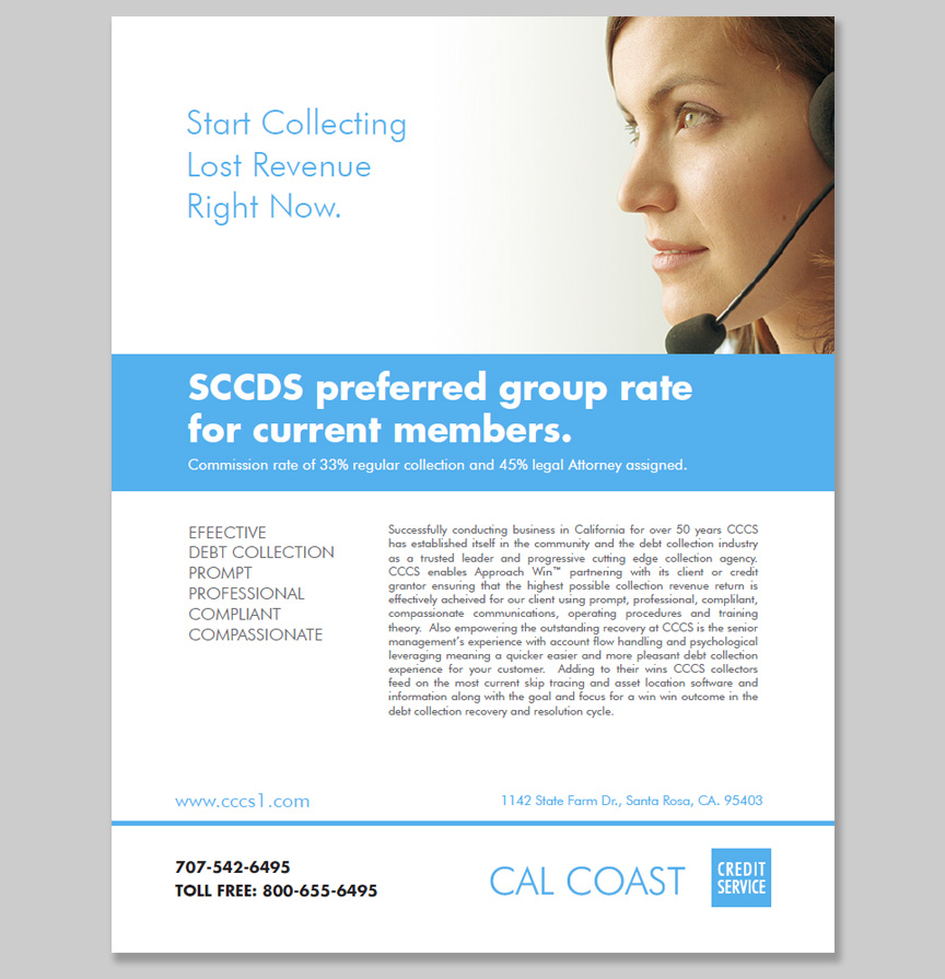
Request: CalCoast Credit contacted me to design an advertisement to be placed in the SCCDS Member Directory.
Solution: After receiving the request, I visited the client's website and was able to gather enough information to create an ad that fit their style and content. I created a compelling call to action, along with a light, open layout that focused on a discount for SCCDS members.
The client was so pleased with the result that he requested the ad to be reformatted as a full page flyer for distribution.
Skills: Adobe Illustrator, copywriting

Used provided assets to create a visually appealing and brand-consistent coupon.
InDesign CS5
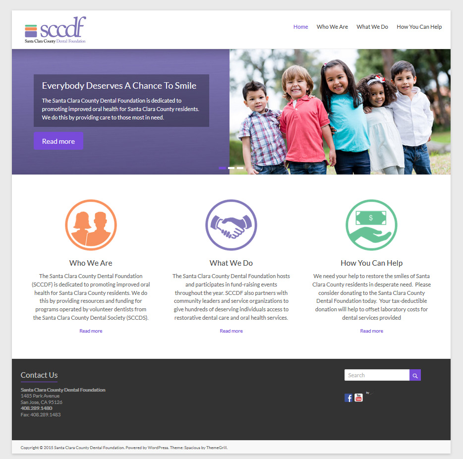
Developed in WordPress using a highly customized version of the "Spacious" theme provided by ThemeGrill.
www.sccdf.org

Request: Santa Clara County Dental Society requested a lapel pin to honor their past presidents.
Solution: I suggested the idea of offering pins to honor life members, past presidents and board members. This way I could reference the three tiered structure of the icon in their logo. I chose to use gold, silver and bronze plated aluminum pins because of the obvious award medal connotation of those precious metals. I also reinforced the concept by using green, orange or lilac jewels to call the logo colors to mind. The Dental Society loved the concept and has since produced and awarded many of these pins to appropriate members.
Skills: Sketching, Adobe Illustrator, vendor relations

The Santa Clara County Dental Society needed a "Year At A Glance" brochure that would allow members to easily see upcoming continuing education events. The Society has scores of events throughout the year, so the challenge was to organize them in an easily digestible format. The design I came up uses a color coded organization for easy reference and is a barrel-fold (rather than tri-fold) to allow for the most content. The overall piece is simple, clean and tidy.
