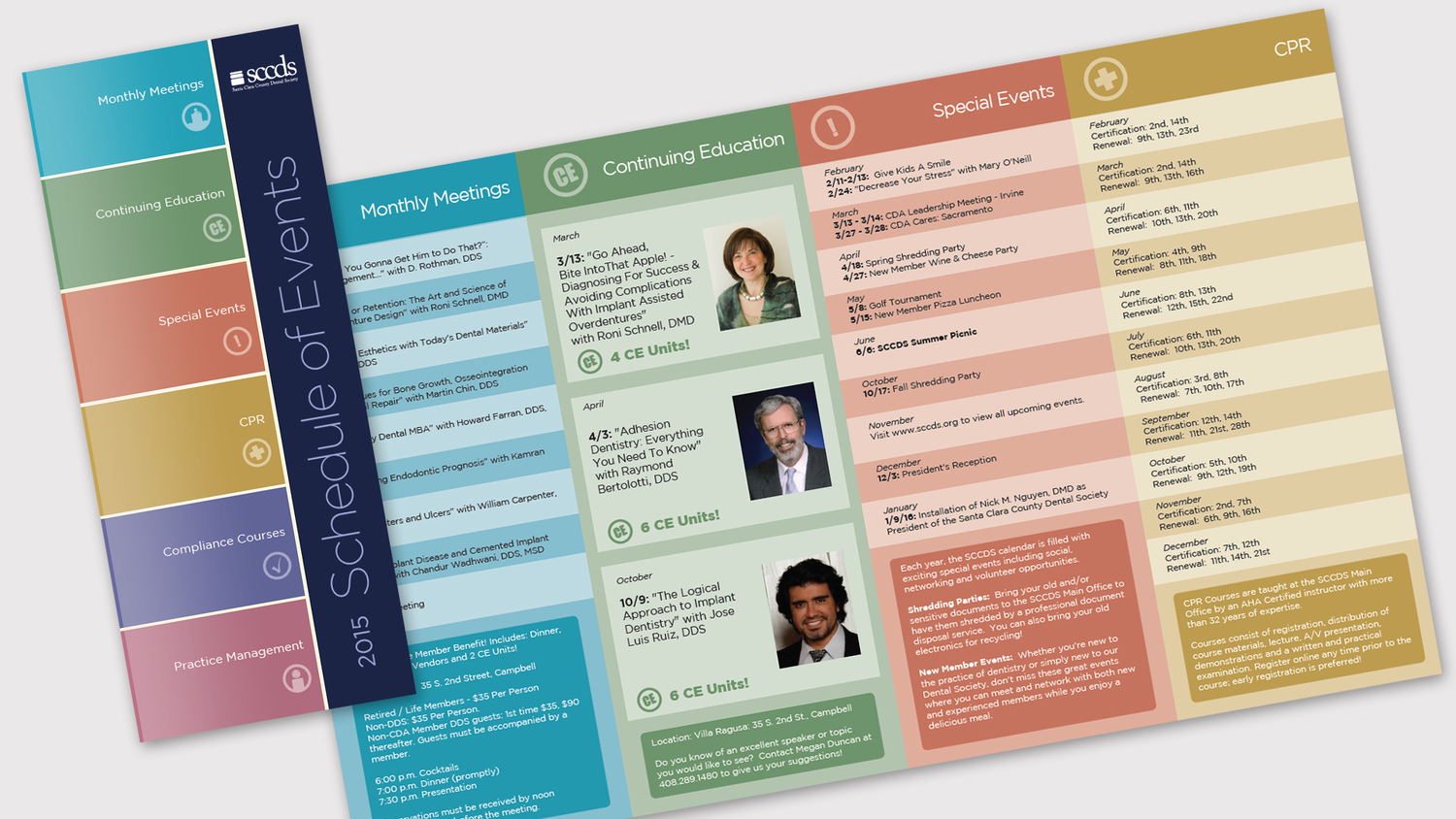
A while back, I proposed an Annual Event program for the Santa Clara County Dental Society. This was one of three brochures I worked on for SCCDS over a short period of time.
I was very happy with the design... it's really simple, clean and flat. The color coded categories make it really easy to locate whatever event that members may be interested in. The font is simple and tidy. The colors are attractive and subdued.
In general, I'm happy with the result.
Design
The design fell into place pretty easily.
I chose the colors based on the colors in the SCCDS logo. I decided to mute the colors to avoid a cartoony, saturated look. The striping was based on the event calendar I include in each month's "Cutting Edge" magazine. I think it makes the event listings easier to read. The font is an old favorite of mine: Gotham. It's readability and simplicity made it my first choice.
The toughest part of the design were the icons. Some of those were easy (CPR, Continuing Education) but, some of them were really tough (Montly Meetings, Practice Management). In the end, I'm not sure if they are all successful, but time constraints prevented me from investing too many minutes on them.
SCCDS members are already using these and I've received a lot of appreciative feedback.

